

Module Documentation
Banners
*If bold, the field is required for module functionality.
Banner: Block With Image
Use this block to highlight short information or core messaging with an optional button.
Headline: Displays as the bold main title of the banner. Use 2–6 words.
Copy: Provides supporting text under the headline. Use this space for a short description or list of key highlights.
Button: Adds a call-to-action button below the copy. Select a link to direct users to a relevant page or resource.
Banner: Call to Action
Use this module to ask users to complete an action. Option for a Button OR a Form can be placed here. Only complete one or the other.
Headline: Appears as the bold title of the banner. Use 1–3 words.
Copy: Appears as the supporting text below the headline. Use 10–15 words.
Button (Choose One): Adds a clickable button under the text. Enter 1–2 words for the label. (Only
use if you are not using the Gravity Form option.)
OR
Form (Choose One): Please include all the Fields you need and who should receive notification emails.
Additional Copy: Displays beneath the button or form. Use 10–15 words for
disclaimers or secondary details.
Banner: Event Countdown
Use this module to indicate a countdown to an event or registration period opening.
Headline: Displays as the bold main title of the banner. Use 1–3 words.
Copy: Appears as supporting text under the headline. Use 10–20 words to describe the event or registration period.
Date/Time (of Event): Sets the target date and time for the countdown timer. Enter the exact event start date and time.
Completed Message: Not Shown, Text that appears once the countdown ends. Use 5–10 words for a short confirmation or follow-up message.
Banner: Form Only
Use this module to have users complete a form. This form will
then be sent, via email, to the email of your choice.
Headline: Appears as the main title of the section. Keep it short, 1–3 words.
Copy: Optional supporting text that appears under the headline. Use 10–15 words.
Form: Please include all the Fields you need and who should receive notification emails.
Banner: Promo
Use this module to promote an announcement, offer, or message with a supporting button link to drive users to a specific page or action.

Headline: Displays as the bold main title of the banner. Use 1–7 words.
Copy: Appears as supporting text under the headline. Use 1–3 short sentences to describe the promotion or announcement.
Call to Action (CTA): Adds a button on the right side of the banner. Enter a link and button label (1–2 words).
Cards
*If bold, the field is required for module functionality.
Cards: Camps Grid
Use this module to highlight a collection of features, programs, or offerings using visually engaging cards. Each card can include a title, copy, image, and Call to Action. Cards can be repeated to display multiple items in a consistent layout. (min 3 – max. 9 cards)
Title: Displays as the bold title beside the cards. Use 2–4 words.
Copy: Appears below the title as supporting text. Use 2–3 sentences to describe purpose of the card set.
Title (One Per Card): Displays as the bold title inside the card. Use 2–4 words.
Copy (One Per Card): Appears as supporting text within the card. Use 1–2 short sentences.
Call To Action Link (One Per Card): Adds a clickable link for the title of the card.
Cards: Contact Info
Use this module to display contact information in a card-based layout. Each card can include a title, phone, email, address, and a Call to Action (CTA) link. This section is repeatable, allowing you to add multiple cards for different locations, departments, or staff.
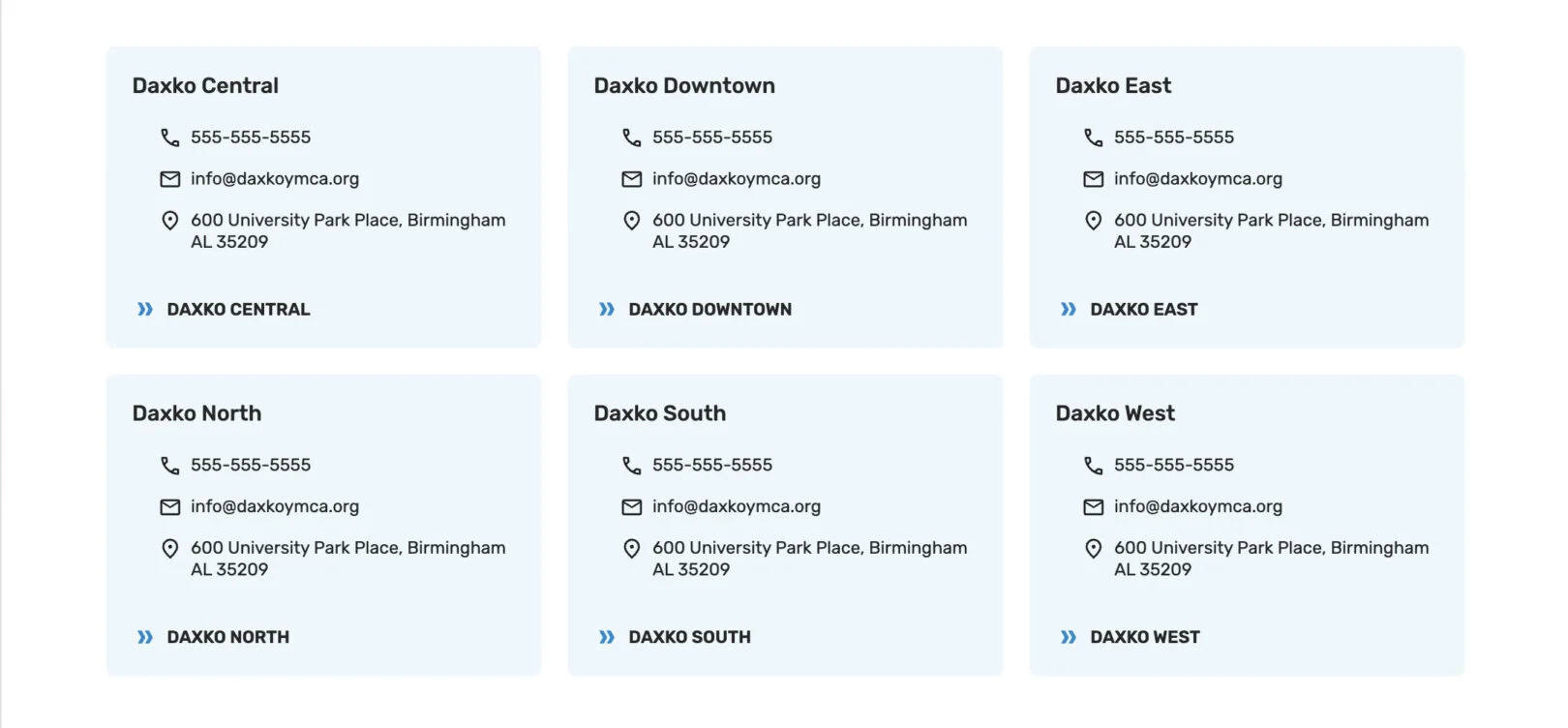
Headline: Introductory text that appears above the contact cards as the bold main title. Use 2–5 words.
Copy: Supporting text that appears under the headline. Use 1–3 sentences
to introduce the contact details.
Title (One Per Card): Displays as the name or heading of the card (e.g., branch name,
department, or staff).
Phone (One Per Card): Adds a linked phone number to the card.
Email (One Per Card): Adds a linked email address to the card.
Address (One Per Card): Displays the physical address. Use full mailing address for clarity.
CTA (One Per Card): Optional button-style link for additional actions (e.g., “More Info” or
“Contact Us”).
Cards: Feature Highlights
Use this module to highlight a collection of features, programs, or offerings using visually engaging cards. Each card can include a title, supporting text, image, and icon.
Cards can be repeated to display multiple items in a consistent layout. (min 4 – max 6 cards)
Headline: Displays as the bold main title above the group of cards. Use 2–5 words.
Copy: Appears below the headline as supporting text. Use 2–3 sentences to describe the overall purpose of the card set.
Title (One Per Card): Displays as the bold title inside the card. Use 2–4 words.
Icon (One Per Card): Displays as an icon above the title. select from a list, upload your own, or provide a URL for where your icons are hosted.
Link (One Per Card) – Not Shown: Adds a clickable link for the card.
Copy (One Per Card): Appears as supporting text within the card. Use 1–2 short sentences.
Cards: Images with Modals
Use this module to display people such as staff, leadership, board members, or instructors. Each card includes a headshot, name, title, and short bio. Cards can also open in a modal popup to reveal additional information. Cards can be repeated to display multiple items in a consistent layout.

Headline: Displays as the bold main title above the card group. Use 2–5 words.
Copy: Appears under the headline as an introduction to the group of cards. Use 1–3 sentences.
Title (One Per Card): Displays the content as a title on the card.
Sub-Title (One Per Card): Shows as a subtitle under the Title.
Copy (One Per Card): Appears as a short description or bio inside the modal popup when the card is clicked.
Call To Action (One Per Card): Text displayed at the bottom of the card that opens the modal content input above. The default text is “Read More,” but this can be changed.
Cards: Info with CTA
Use this module to display informational cards with optional
calls to action or embedded forms. Each card can include a title, description, and a direct link or Form. This module is ideal for highlighting resources, policies, or commitments in a flexible card layout. Cards can be repeated to display multiple items in a consistent layout.
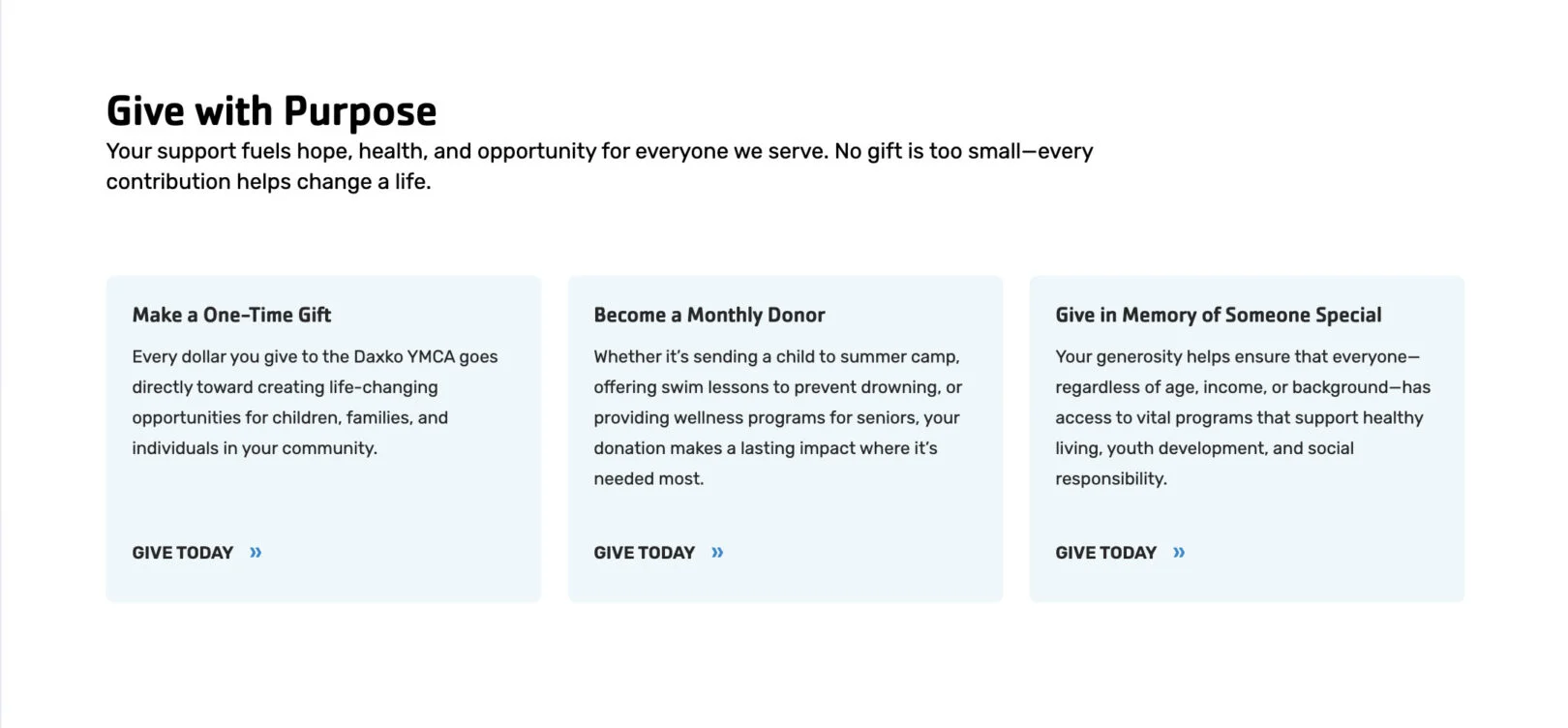
Headline: Displays as the bold main title above the card group. Use 2–5 words.
Copy: Appears as the introductory text below the headline. Use 2–4 sentences to
explain the purpose of the card group.
Title (One Per Card): Displays as the card’s bold heading. Use 2–4 words.
Copy (One Per Card): Appears as the card description. Use 1–3 sentences.
Call To Action (One Per Card): Adds a clickable button under the card. Enter a link and
button label. Use this option instead “Form” if you want a button.
OR
Form (One Per Card): Please create a single field form for this section. Please include type and name of field you need and who should receive notification emails.
Cards: Info Only
Use this module to present grouped information in a card layout. This module is ideal for displaying schedules, seasonal details, or key highlights where multiple items share a consistent structure. Cards can be repeated to display multiple items in a consistent layout. (min 2 – max 8 cards)
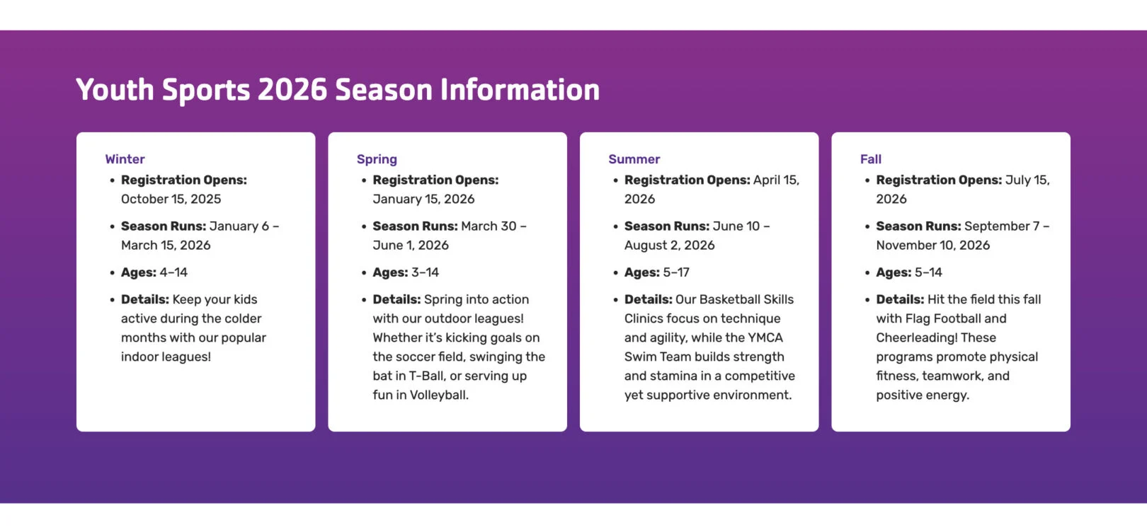
Headline: Displays as the bold main title above the card group. Use 2–5 words.
Copy: Appears as supporting text below the headline. Use 2–4 sentences to explain the purpose of the card group.
Title (One Per Card): Displays as the bold heading inside the card. Use 1–3 words.
Copy (One Per Card): Main text content of the card. Use short paragraphs or bullet points to highlight details.
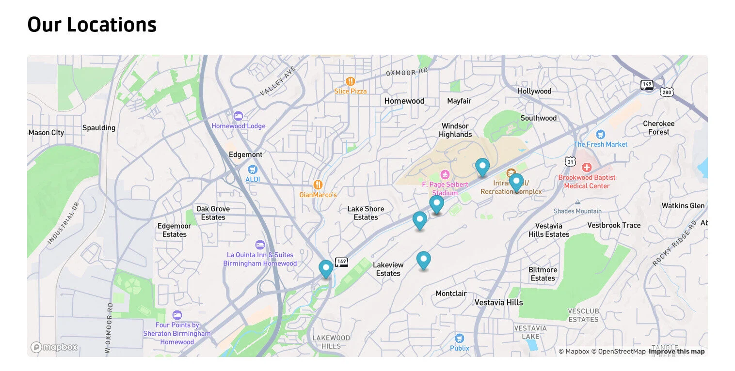
Cards: Locations
Use this module to display multiple locations in a grid layout.

Headline: Appears as the title above the grid of location cards. Keep it short, about 2–7 words.
Map Center Point: An address at which the map view is centered.
Map Zoom Level: A number between 1 – 20 that determines how close the map view is to the Map Center Point.
Markers (Repeatable): Each location marker creates a pin on this map.
Title (One Per Marker): Displays as the title within the location card and a modal when clicked.
Description (One Per Marker): Displays as a few sentences of information beneath the title within the location card and a modal when clicked.
Location (One Per Marker): Address of where you would like to display a marker or pin on the map.
Phone Number (One Per Marker): Displays
as a clickable phone number within the location card and a modal when clicked.
Link (One Per Marker): Adds a clickable text link within the location card and a modal when clicked.
Cards: Numbered
Use this module to display content in a numbered format. Eachcard includes a number, title, and supporting copy. This layout is especially effective for outlining processes, steps, or teaching methods where order and progression are important. Cards can be repeated to build a complete sequence. Cards can be repeated to display multiple items in a consistent layout.
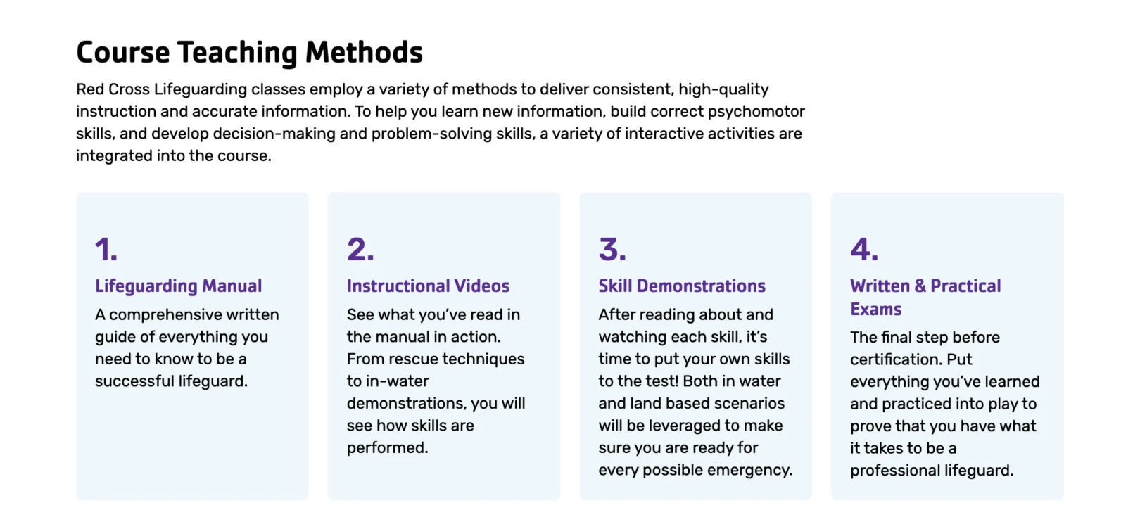
Headline: Displays as the bold main title above the card group. Use 2–5 words.
Copy: Displays as supporting text beneath the headline. Use 2–3 sentences to introduce the numbered steps.
Number/Title (One Per Card): Displays as the bold step number or title on the card. Use a single digit or short title.
Sub-Title (One Per Card): Displays as the bold title of the card. Use 2–4 words to name the step or phase.
Copy (One Per Card): Displays as the descriptive content of the card. Use 15–30 words to explain the step in detail.
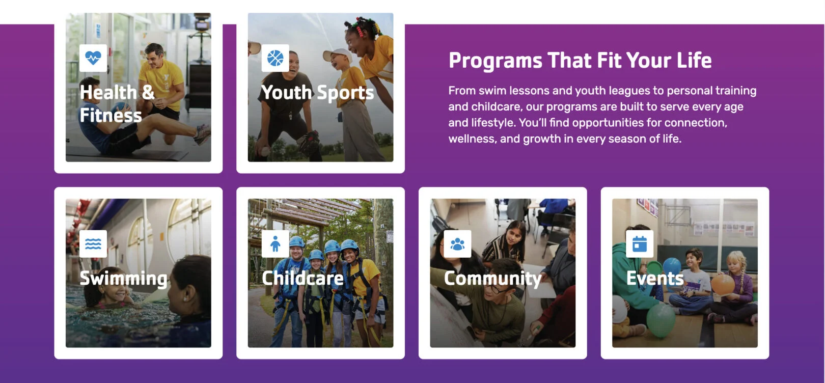
Cards: Programs Grid
Use this module to display 1–2 word information in a clean, visual grid. Each card features an image, title, and link, allowing users to quickly explore different offerings or sections of your site. Cards can be repeated as needed to showcase multiple programs. (min 2 – max 9 cards)
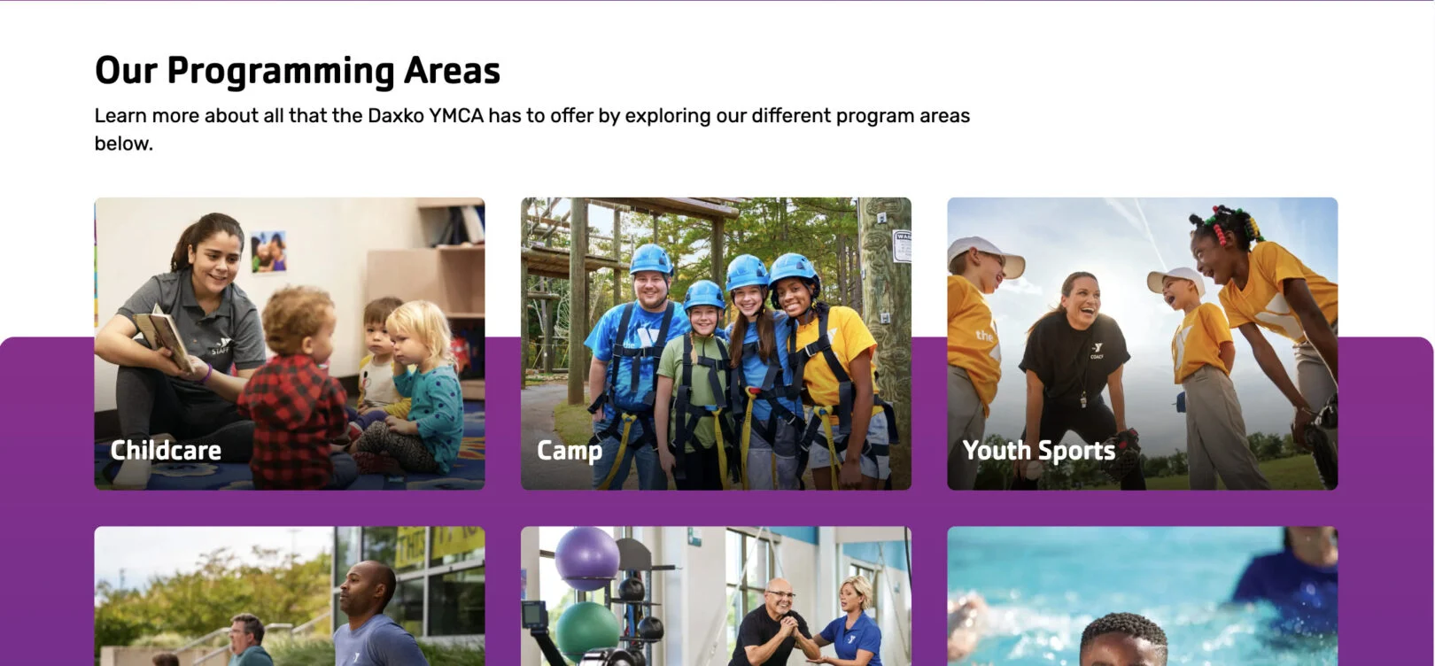
Headline: Displays as the bold main title above the card grid. Use 2–5 words.
Copy: Appears as the supporting text under the headline. Use 2–3 sentences to introduce or explain the content of the cards.
Title (One Per Card): Displays as the bold title of the card. Use 1–4 words.
Call To Action (One Per Card): Adds a clickable link to the card. Select the destination page or URL.
Cards: Resources
Use this module to highlight short information. Each card can include an image, title, and Call to Action (CTA) link, making it easy for users to explore available support and programs. Cards can be repeated as needed to showcase multiple programs. (min 2 – max 9 cards)
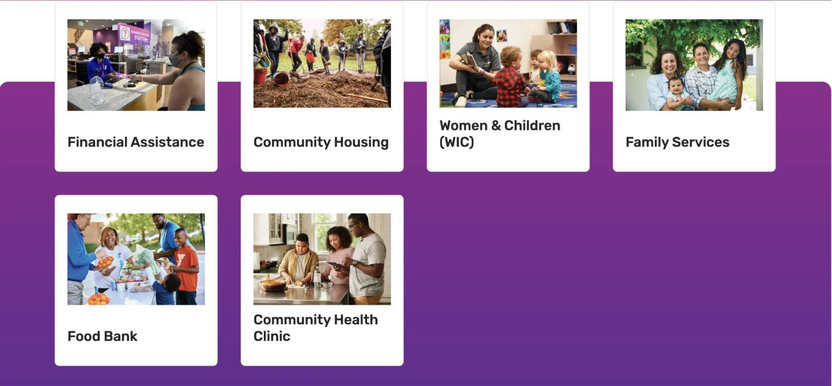
Headline: Displays as the bold main title above the card group. Use 2–5 words.
Copy: Appears as the descriptive text below the headline. Use 2–4 sentences to introduce the resources and explain their value.
Title (One Per Card): Displays as the bold title on the card. Use 1–4 words.
Call T0 Action (One Per Card): Adds a link to the card to guide users to more details.
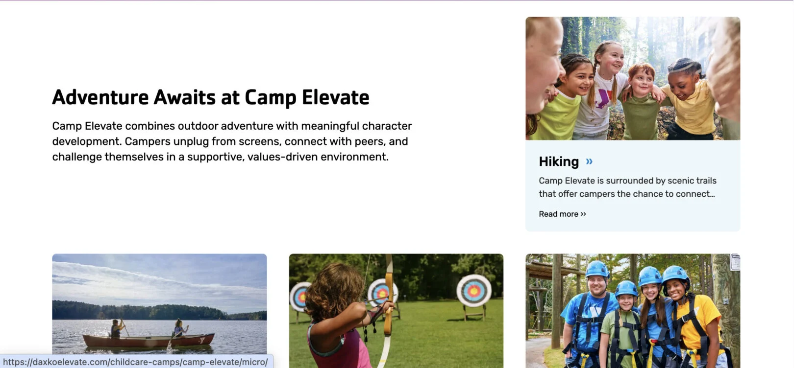
Cards: Three Images
Use this module to display three key highlights, programs, or initiatives side by side. Each card can include an image, title, supporting text, and a Call to Action (CTA) button, making it easy to feature important ways for users to get involved.
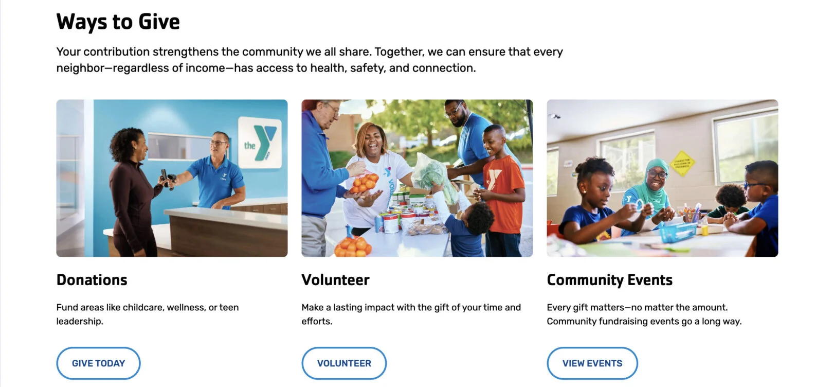
Headline: Displays as the bold main title above the card group. Use 2–5 words.
Copy: Appears as the supporting text below the headline. Use 2–3 sentences to explain the purpose of the section or provide additional context.
Title (One Per Card): Displays as the bold heading for the card. Use 2–4 words.
Copy (One Per Card): Appears as the supporting description under the title. Use 1–2 sentences.
CTA (One Per Card): Adds a button below the copy. Enter a link and button label.
Cards: Two Images
Use this module to display two cards side by side. Each card includes an image, a title, supporting text, and an optional Call to Action (CTA) button. This layout is useful for presenting paired options or related information in a visually balanced format.
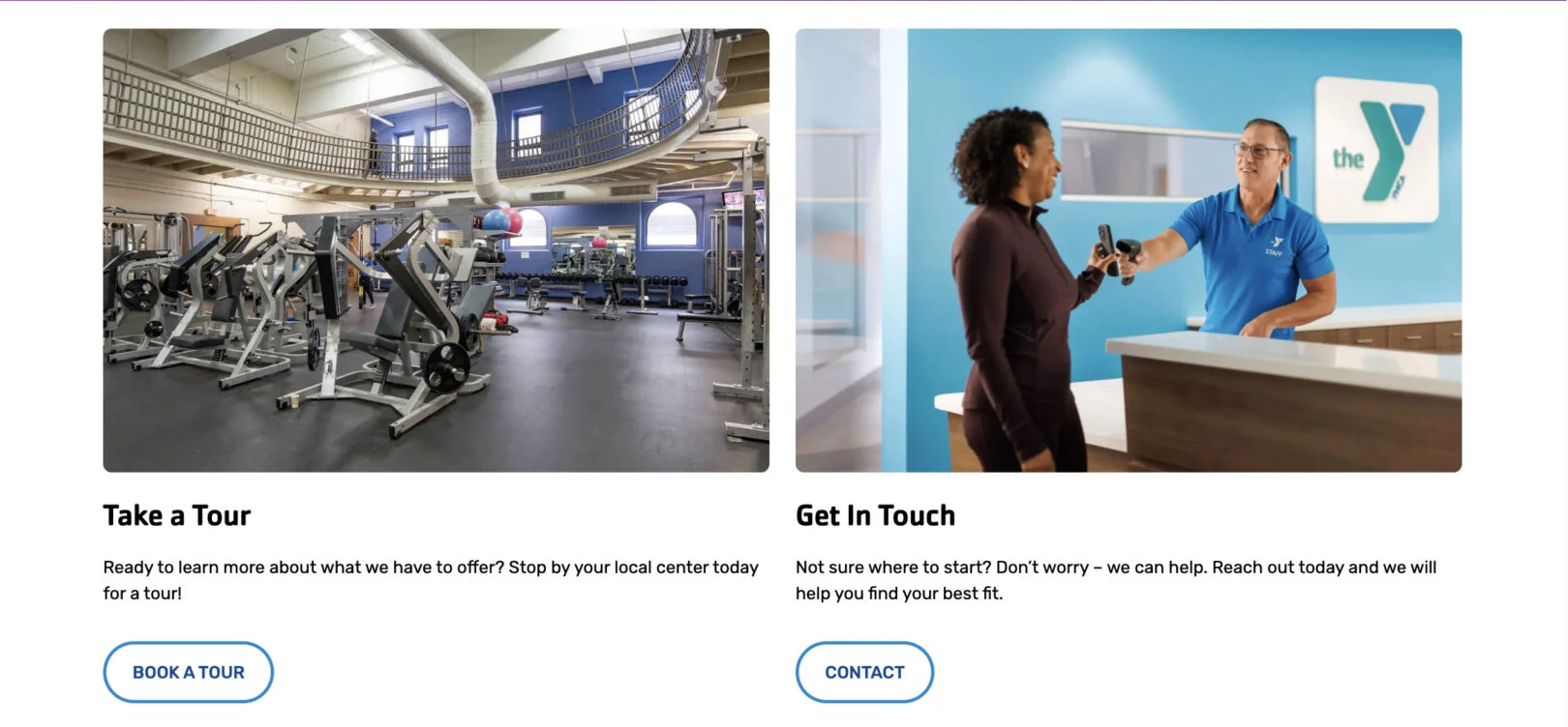
Title (One Per Card): Displays as the bold title of each card. Use 2–5 words.
Copy (One Per Card): Appears as the descriptive text below the title. Use 2–3 sentences to provide supporting information.
CTA (One Per Card): Adds a button under the text. Enter a link and button label. Optional field.
Cards: Video Grid
Use this module to feature multiple videos in a grid format. Each card includes a video link, optional background image, and a short title. This is best used for highlighting stories, testimonials, or video-based resources. The cards can be repeated to showcase more than one video. Cards can be repeated as needed to showcase multiple programs. (min 2 – max 4 cards)

Headline: Displays as the bold main title above the video grid. Use 2–5 words.
Copy: Appears as supporting text under the headline. Use 2–4 sentences to introduce the video content.
Video (One Per Card): Paste a video link (e.g., YouTube or Vimeo) to embed in the card.
Title (One Per Card): Add a short descriptive title for the video. Use 1–3 words.
Cards: With Icons
Use this module to present information in a card layout that includes icons. Each card can feature an icon, a title, and supporting text, making it ideal for highlighting membership benefits, services, or key features. Cards can be repeated as needed to showcase multiple programs. (min 2 cards)
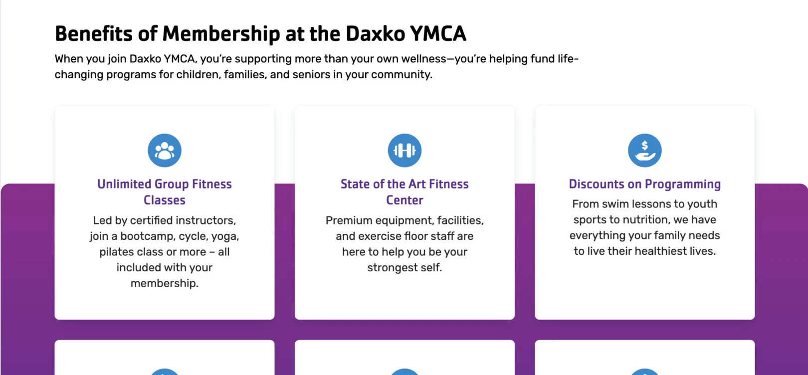
Headline: Displays as the bold main title above the card group. Use 2–5 words.
Copy: Appears as the main descriptive text below the headline. Use 2–3 sentences to introduce the group of cards.
Icon (One Per Card): Displays as an icon above the title. select from a list, upload your own, or provide a URL for where your icons are hosted.
Title (One Per Card): Displays as the bold heading of the card. Use 2–4 words.
Copy (One Per Card): Appears as the supporting text of the card. Use 1–2 short sentences.
Content
*If bold, the field is required for module functionality.
Content: Block with Cards
Use this module to highlight membership options or similar offerings in a structured, visual format. Each card can include a title, subtitle, description, optional pricing, and a background image. A Call To Action (CTA) button can be added to drive users to explore more details or sign up.
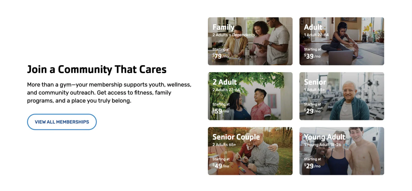
Headline: Displays as the bold section title above the card group. Use 2–5 words.
Copy: Appears under the headline as supporting text. Use 1–3 sentences.
Call to Action (CTA): Adds a button below the overview copy. Enter a link and label.
Title (One Per Card): Bold title for the card. Keep it 2–4 words.
Subtitle (One Per Card): Optional smaller line under the title. 3–5 words.
Description (One Per Card): Supporting text. Max character limit: 140. Only displays once the card is clicked.
Price (One Per Card): Optional pricing field (e.g., “Starting at $X/mo”). Can be displayed as “/mo” or “/yr.”
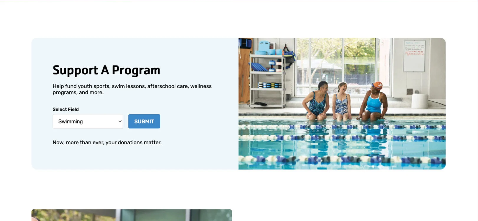
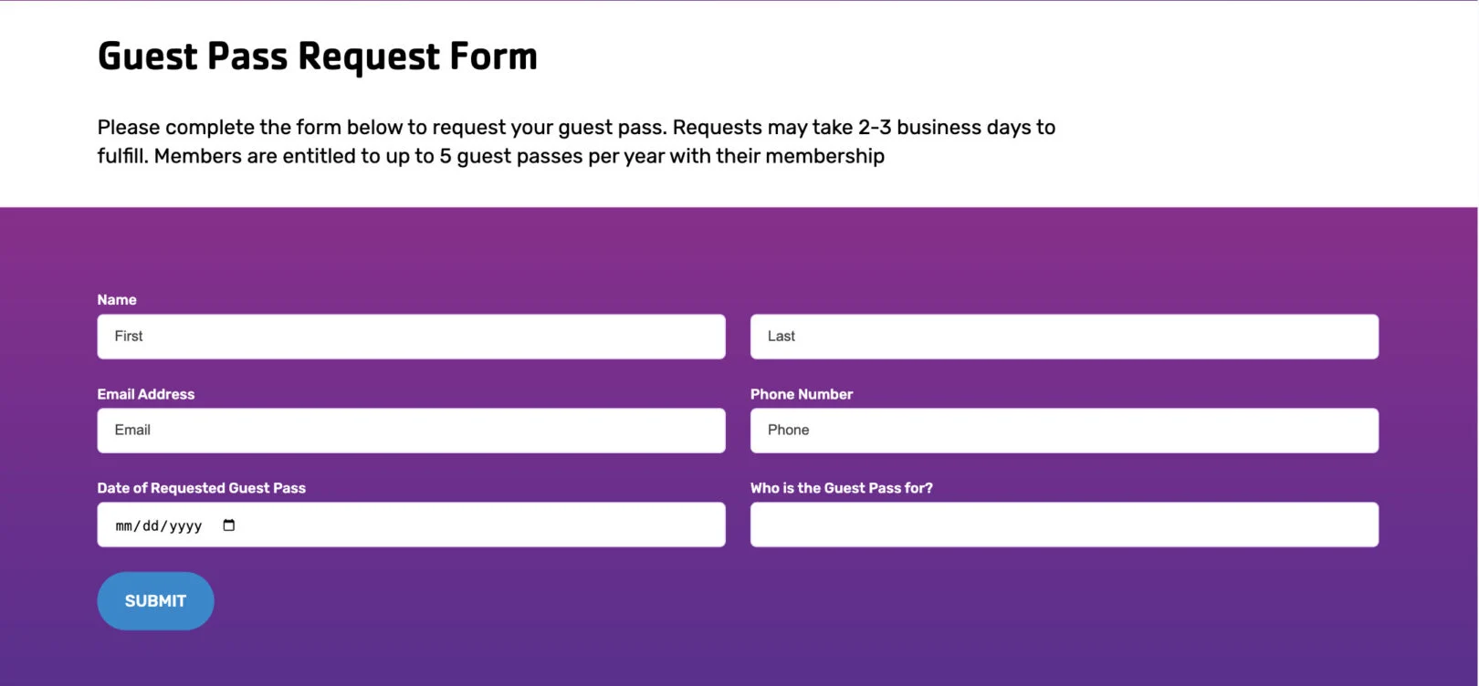
Content: Block with Form
Use this module to display a block of text alongside a form. The block can include a headline and copy for context, while the form allows users to directly submit inquiries or information. The form can be positioned on either the left or right side of the block.
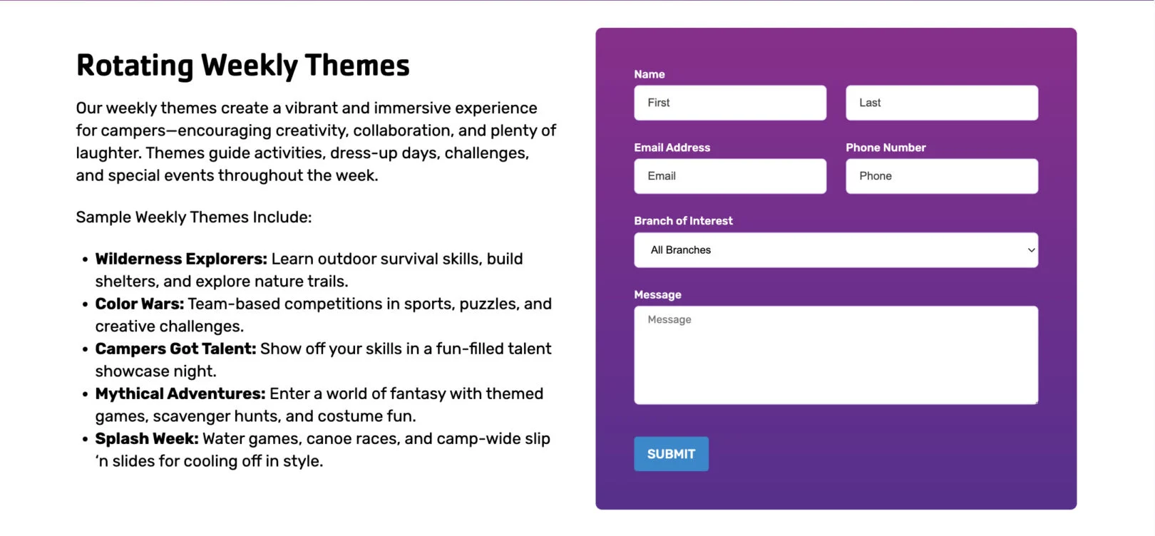
Headline: Displays as the bold main title above the content block. Use 2–5 words.
Copy: Appears as supporting text beneath the headline. Use 3–5 sentences to provide context or instructions for the form.
Form: Please include all the Fields you need and who should receive notification emails.
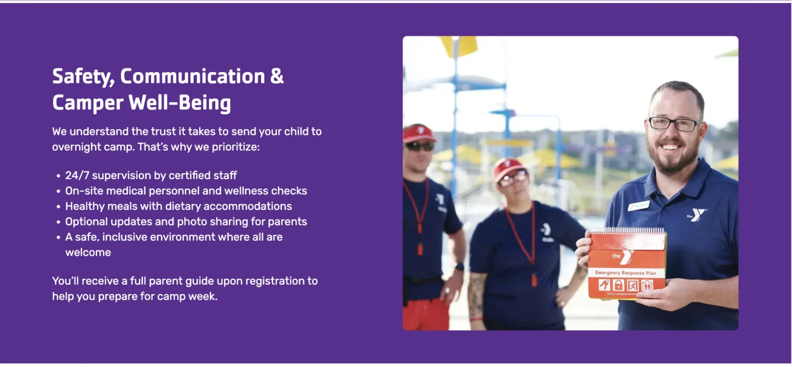
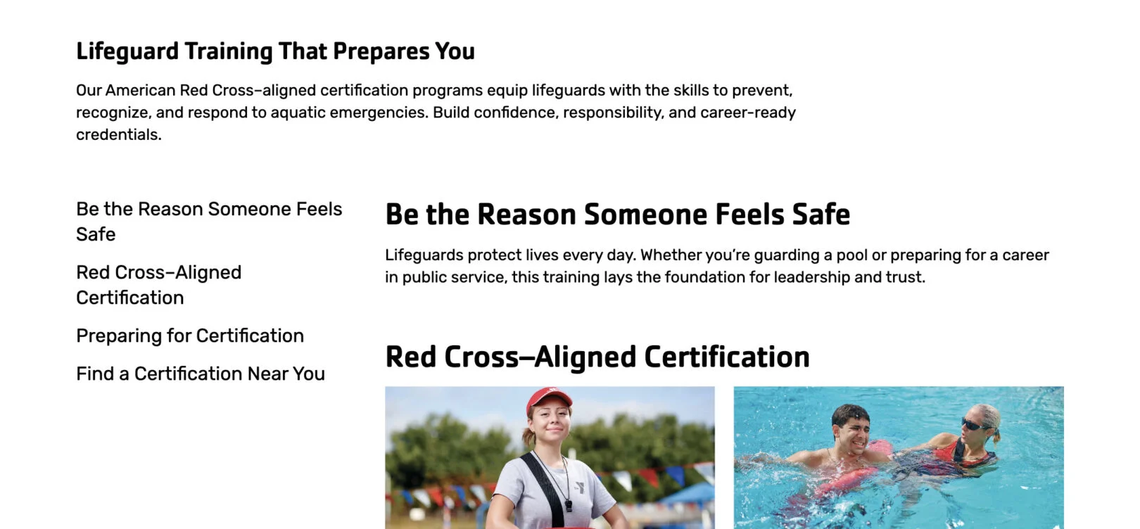
Content: Block with Image
Use this module to display a block of text alongside an image. You can include a call-to-action button for added engagement. The image position can be adjusted to appear on the left or right of the text.

Headline: Displays as the bold main title of the section. Use 2–5 words.
Copy: Appears as the main text content under the headline. Use 3–5 sentences to explain the message or highlight the key information.
Call To Action (CTA) (Repeatable): Adds a button(s) below the text. Enter a link and button label.
Content: Block with Map
Use this module to display a block of text alongside either a non-interactive image of the map taken as a screenshot from Google Maps or as an interactive map box. This can also be used for any image instead of map for broader use cases.
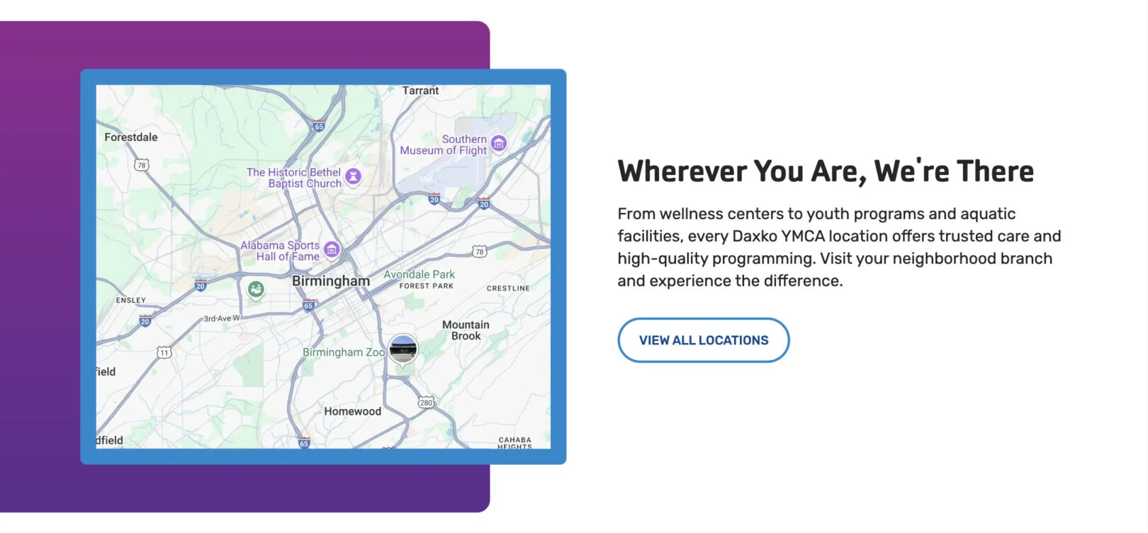
Headline: Appears at the top of the module. Keep short and clear, about 2–7 words.
Copy: Displays as the intro paragraph below the headline. Use 2–4 sentences of plain text, friendly and informative.
Call to Action (CTA) (Repeatable): Adds a clickable button(s) under the text. Keep the name action-focused (e.g., “Learn More”).
Map Center Point: An address at which the map view is centered.
Map Zoom Level: A number between 1 – 20 that determines how close the map view is to the Map Center Point.
Markers (Repeatable): Each location marker creates a pin on this map.
Title (One Per Marker): Displays as the title within a modal when clicked.
Description (One Per Marker): Displays as a few sentences of information beneath the title within a modal when clicked.
Location (One Per Marker): Address of where you would like to display a marker or pin on the map.
Phone Number (One Per Marker): Displays
as a clickable phone number within a modal when clicked.
Link (One Per Marker): Adds a clickable text link within a modal when clicked.
Content: FAQ
Use this module to list up to 5 common questions and their answers.
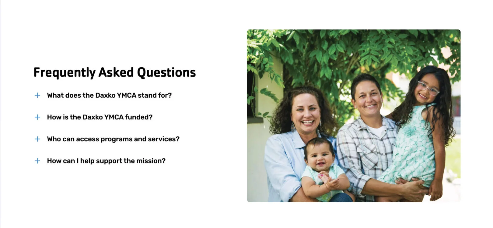
Headline: Appears as the section title above the list of questions. Keep it short, about 2–7 words.
Question (One Per Card): Enter the question text. This will display in the collapsible list. Keep it brief, 5 – 15 words.
Answer (One Per Card): Enter the response to the question. This shows when the question is expanded. Use 2–3 sentences max.
Content: Longform
Use this module to display an extensive section of text content, featuring an optional button and the possibility of additional content blocks for up to two images per-section and text.
Headline: Appears at the top of the module. Keep short and clear, about 2–7 words.
Copy: Displays as the intro paragraph below the headline. Use 2–4
sentences of plain text, friendly and informative.
Sub-Headline (One Per-Section): This is the bold title for each section. Keep it short—about 4–6 words.
Body Copy (One Per-Section): Appears as regular text under the block headline. Write 3–5 sentences.
Call to Action (CTA) (One Per-Section): Adds a clickable button under the text. Keep the name action-focused (e.g., “Learn More”).
Content: Map Box
Use this module to display all locations as pins on a large map.
Headline: Appears as the main bold title above the section text. Keep it short, about2–7 words.
Copy: Displays as the intro paragraph below the headline. Use 2–4
sentences of plain text, friendly and informative.
Map Center Point: An address at which the map view is centered.
Map Zoom Level: A number between 1 – 20 that determines how close the map view is to the Map Center Point.
Markers (Repeatable): Each location marker creates a pin on this map.
Title (One Per Marker): Displays as the title within a modal when clicked.
Description (One Per Marker): Displays as a few sentences of information beneath the title within a modal when clicked.
Location (One Per Marker): Address of where you would like to display a marker or pin on the map.
Phone Number (One Per Marker): Displays
as a clickable phone number within a modal when clicked.
Link (One Per Marker): Adds a clickable text link within a modal when clicked.
Content: Tabbed
Use this module to organize content into separate tabs.

Tab Name (One Per Tab): Displays as a tab for users to select to change which content tab is displayed. Use 1 – 3 words.
Headline (One Per Tab): Displays as a short title beneath the tab. Use 1 – 5 words.
Copy (One Per Tab): Displays as semi-long form content underneath the headline. Use 1 – 5 sentences max.
Embed Information (One Per Tab): Provide the embed code for the software scheduler of your choice
Content: Text Only
Use this module to display a short block of text without images.
Headline: Appears as the bold title above the paragraph. Keep it short, about 2–7 words.
Copy: Displays as the paragraph under the headline. Use 2–4 sentences.
Call to Action (CTA) (Repeatable): Adds a clickable button(s) under the text. Keep the name action-focused (e.g., “Learn More”).
Embeds & Plugins
*If bold, the field is required for module functionality.
Daxko Membership
Use this module to show membership options configured in your Operations account and allow users to join online.

Which memberships should show online?
Which location options should be shown? Leave blank to show all locations. Enter a location ID (e.g. 12345) to preselect a location, or enter one or more negative IDs separated by commas (e.g. -12345,-22245) to exclude locations.
What colors do you want to use for plugin? (If left blank we will use branding colors selected for the rest of the site):
Please submit images you’d like used for the membership types.
Daxko Programs
Use this module to display available programs configured in your Operations account and let users register.

Which tags/categories/location should this plugin be filtered on for this page, if any?:
What colors do you want to use for plugin? (If left blank we will use branding colors selected for the rest of the site):
Group Ex Pro Schedule
Use this module to display available schedules configured in your Group Ex Pro account.
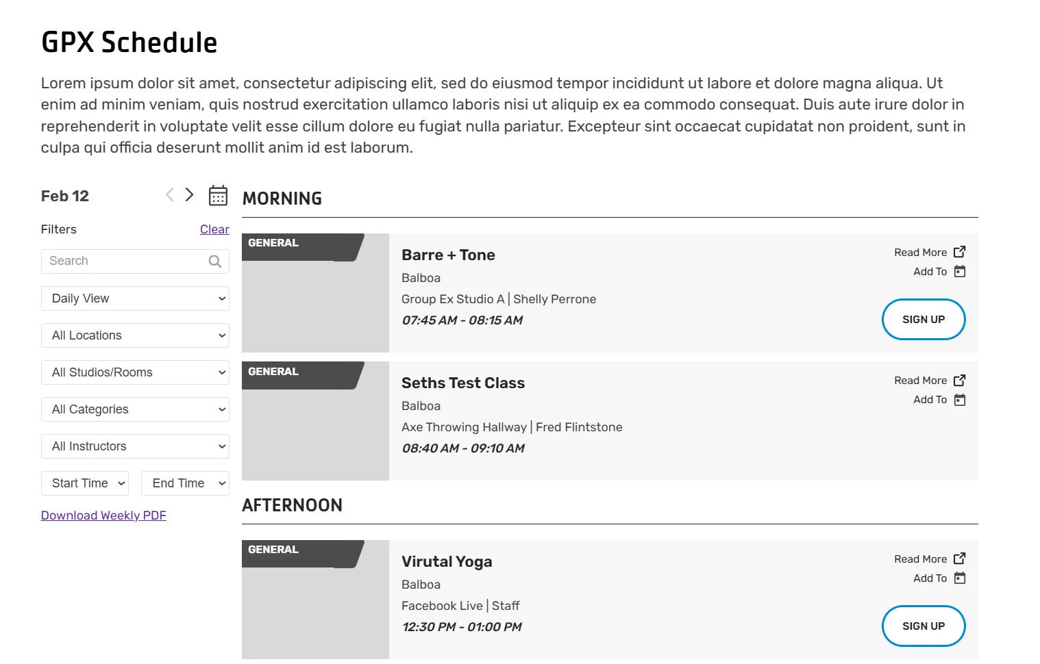
What should be the default view? Weekly or Daily?
Do you have a Location or Studio/Room that you would like the view to be filtered by?
Hero
*If bold, the field is required for module functionality.
Hero: Home
Use this module to create the main header section usedprimarily on the home page.

Subheader: Appears as small text above the main headline. Keep it short, 1–3 words.
Page Header: Displays as the large main headline. Keep it clear and concise, about 2–7 words.
Call to Action (CTA): Adds a button under the text. Enter a link and keep the button name action-based (e.g., “Join Now”).
Hero: Subpage
Use this module to create the main header section on a subpage.

Subheader: Appears as small text above the main headline. Keep it short, 1–3 words.
Page Header: Displays as the large main headline. Keep it clear, about 2–7 words.
Breadcrumb: Auto displays based on the parent URLs of the page you are on. Can be hidden manually.
Call to Action (CTA): Adds a button under the text. Enter a link and button label.
Intro
*If bold, the field is required for module functionality.
Intro: Event
Use this module to add an introduction section with text, event information, and supporting images. This module is only available for posts, not pages.
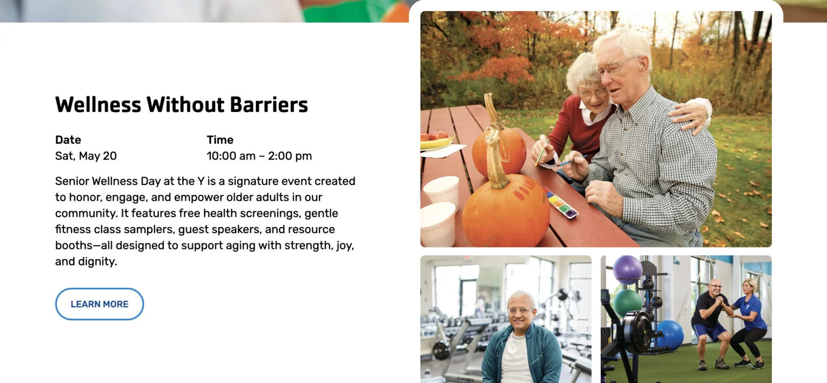
Headline: Appears as the main bold title above the section text. Keep it short, about2–7 words.
Date & Time: Appears as a two column content section that displays the full event duration
Copy: Appears as the main paragraph text. Write 3–5 sentences.
Call to Action (CTA): Adds a button under the text. Enter a link and button label.
Intro: Location
Use this module to introduce a location with a map and supporting details. This module is only available on “Location” pages.
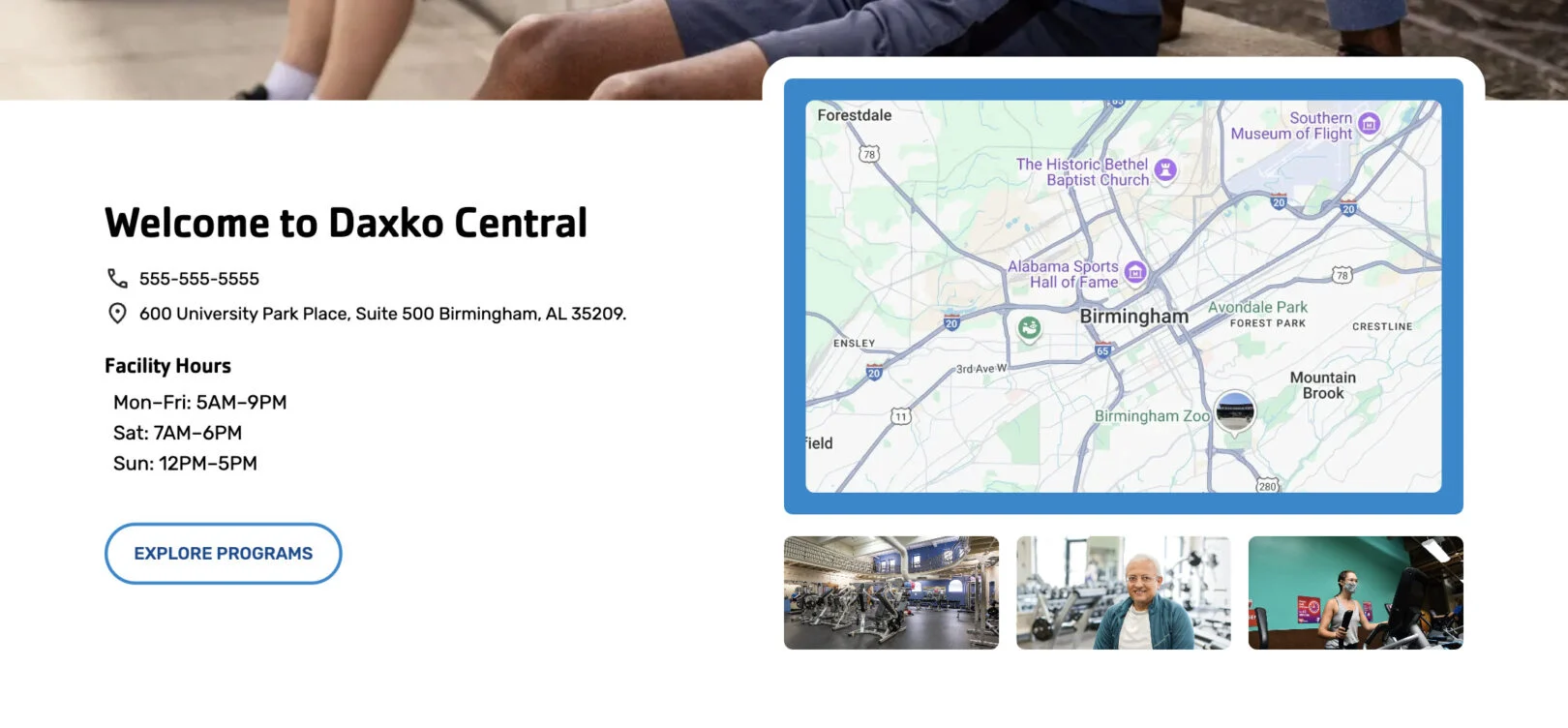 Headline: Appears as the bold location name at the top of the section.
Phone: Displays as a clickable phone number under the headline.
Address: Displays as the street address under the phone number.
Facility Hours: Main hours of operation for the facility. Use list or paragraph format.
Secondary Hours Title (Optional): Not Shown Label for a second set of hours (e.g., “Y Playhouse”).
Second Set of Hours (Optional): Not Shown Additional hours, displayed under the secondary title.
Call to Action (CTA): Adds a button under the text. Enter a link and button label.
Copy: Appears a paragraph of text. 3–5 sentences.
Intro: Primary
Use this module to add an introduction section with text and supporting content.

Headline: Appears as the main bold title above the section text. Keep it short, about 2–7 words.
Subtitle: Displays directly below the headline in smaller text. Use 1 short phrase or sentence.
Copy: Appears as the main paragraph text. Write 3–5 sentences.
Call to Action (CTA): Adds a button under the text. Enter a link and button label.
Intro: Secondary
Use this module to add an introduction section with text and supporting content.

Headline: Appears as the main bold title above the section text. Keep it short, about 2–7 words.
Copy: Appears as the main paragraph text. Write 3–5 sentences.
Call to Action (CTA): Adds a button under the text. Enter a link and button label. Can be repeated. (max 2)
Intro: Single
Use this module to add an introduction section with text and supporting content.

Headline: Appears as the main bold title above the section text. Keep it short, about2–7 words.
Copy: Appears as the main paragraph text. Write 3–5 sentences.
Call to Action (CTA): Adds a button under the text. Enter a link and button label.
Slider
*If bold, the field is required for module functionality.
Slider: Amenities
Use this module to display amenities in a sliding carousel.
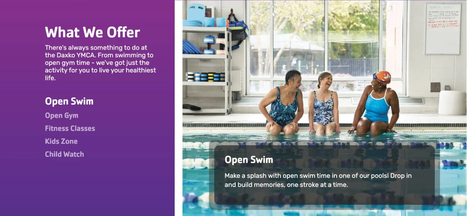
Headline: Appears as the section title above the list of amenities.
Copy: Displays as short text under the headline. Use 1–2 sentences.
Title (One Per Slide): Appears as the clickable amenity name in the left-hand list.
Description (One Per Slide): Displays as the text overlay on the image when that amenity is selected. Use 2–3 sentences.
Slider: Stories
Use this module to display stories in a sliding carousel.
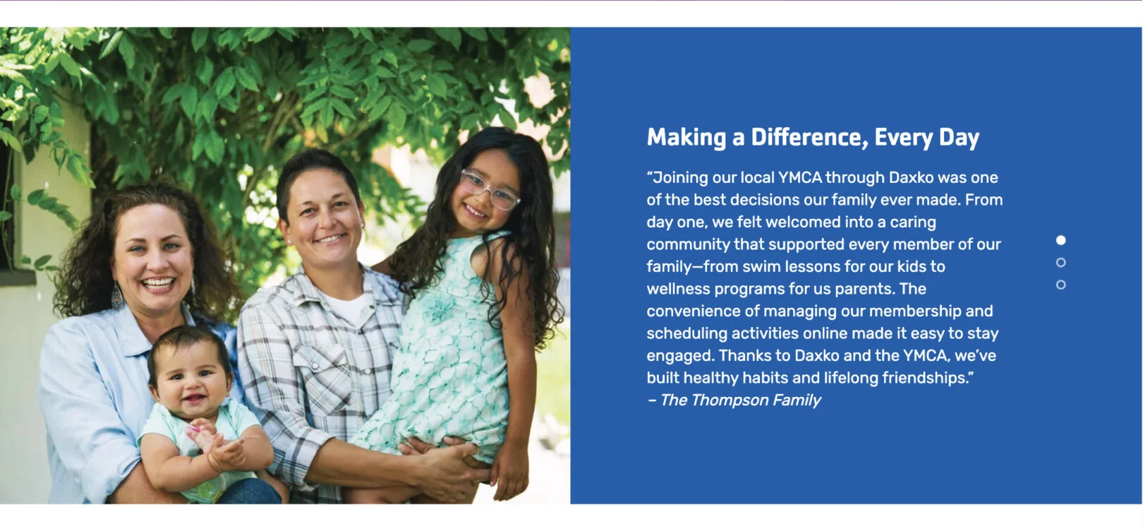
Title (One Per Slide): Optional. It can be used as an internal label, but it is not prominent on the website.
Copy (One Per Slide): Appears as the testimonial quote text. Use 2–3 sentences.
Slider: Testimonials
Use this module to display testimonials in a sliding carousel.
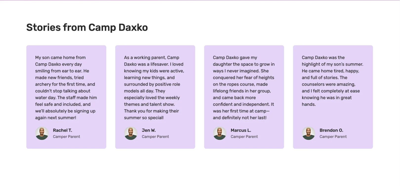
Headline: Appears as the section title above the testimonials.
Copy: Displays as short text under the headline. Use 1–2 sentences.
Copy (One Per Slide): Not Shown Appears as the testimonial quote text. Use 2–3 sentences.
Person Name (One Per Slide): Displays as the name of the person giving the testimonial.
Title (One Per Slide): Displays as the person’s role or identifier (e.g., “Parent of camper”).
Spotlight
*If bold, the field is required for module functionality.
Spotlight: Amenities
Use this module to highlight a specific amenity with text and images.

Headline: Appears as the title above the grid of location cards. Keep it short, about 2–7 words.
Copy: Displays as a bulleted list content under the headline.
Call to Action (CTA): Adds a button under the text. Enter a link and button label.
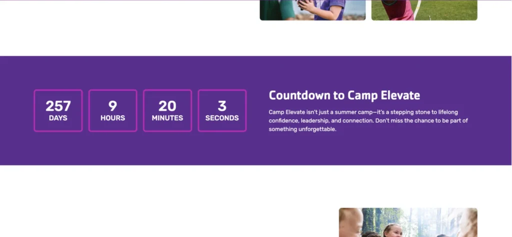
Spotlight: Camp
Use this module to highlight a camp with supporting details like a countdown.

Subtitle: Appears as small text above the headline. Use 2-4 words.
Headline: Appears as the title above the grid of location cards. Keep it short, about 2–7 words.
Copy: Appears as the main text content under the headline. Use 3–5 sentences.
Call to Action (CTA): Adds a button under the text. Enter a link and button label.
Countdown: Adds a live countdown timer below the section text. Enter the event name and the date/time for the countdown.
Completed Message: Not Shown, Text that appears once the countdown ends. Use 5–10 words for a short confirmation or follow-up message.
Spotlight: Content
Use this module to highlight a piece of content with text and images.

Headline: Appears as the title above the grid of location cards. Keep it short, about 2–7 words.
Copy: Displays as the main text content under the headline. Use 3–5 sentences.
Call to Action (CTA): Adds a button under the text. Enter a link and button label. This can be repeated. (max 2 CTAs)
Video Link: Adds a link to your video of choice that will add a play button overtop of the image.
Misc. / Blog
*If bold, the field is required for module functionality.
Blog: Components
This module is used only in posts as the hero/header for individual blog posts.

Subheader: Appears as small text above the main headline. Keep it short, 1–3 words.
Page Header: Displays as the large main headline. Keep it clear, about 2–7 words.
Call to Action (CTA): Adds a button under the text. Enter a link and button label.
Blog: Featured
Use this module to highlight specific blog posts by featuring them in a prominent section. You can select multiple already published blog posts to display, making it easy to showcase important updates, stories, or announcements.
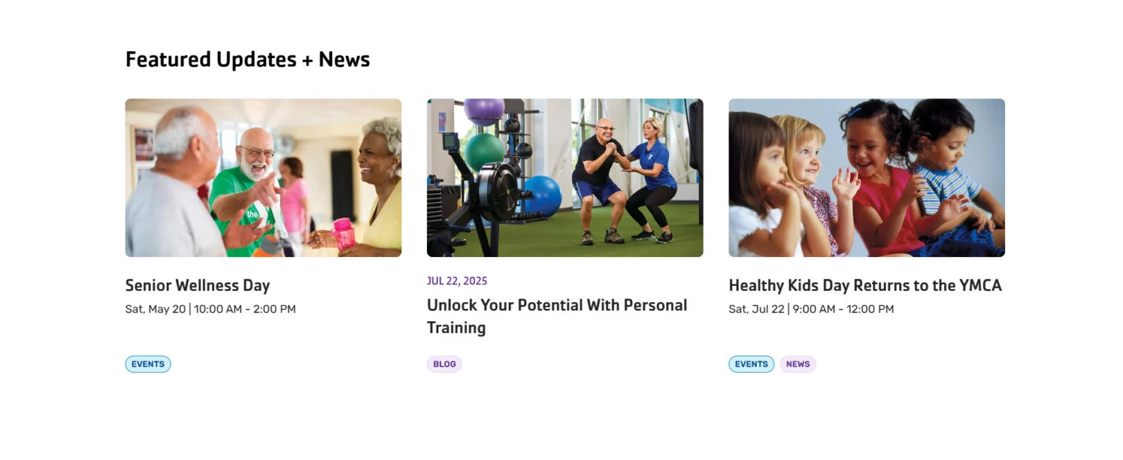
Headline: Displays as the title above the featured posts. Use 1–7 words to introduce the section.
Featured Posts: List one or more blog posts you are creating to display in the featured section. Each post will show its title, date, excerpt, and category tags.
Blog: Feed
Use this module to display a continuous feed of blog posts, news, or events. Posts are pulled automatically from selected categories and displayed in a grid layout with options to load more content. This module is only available in posts and not pages.
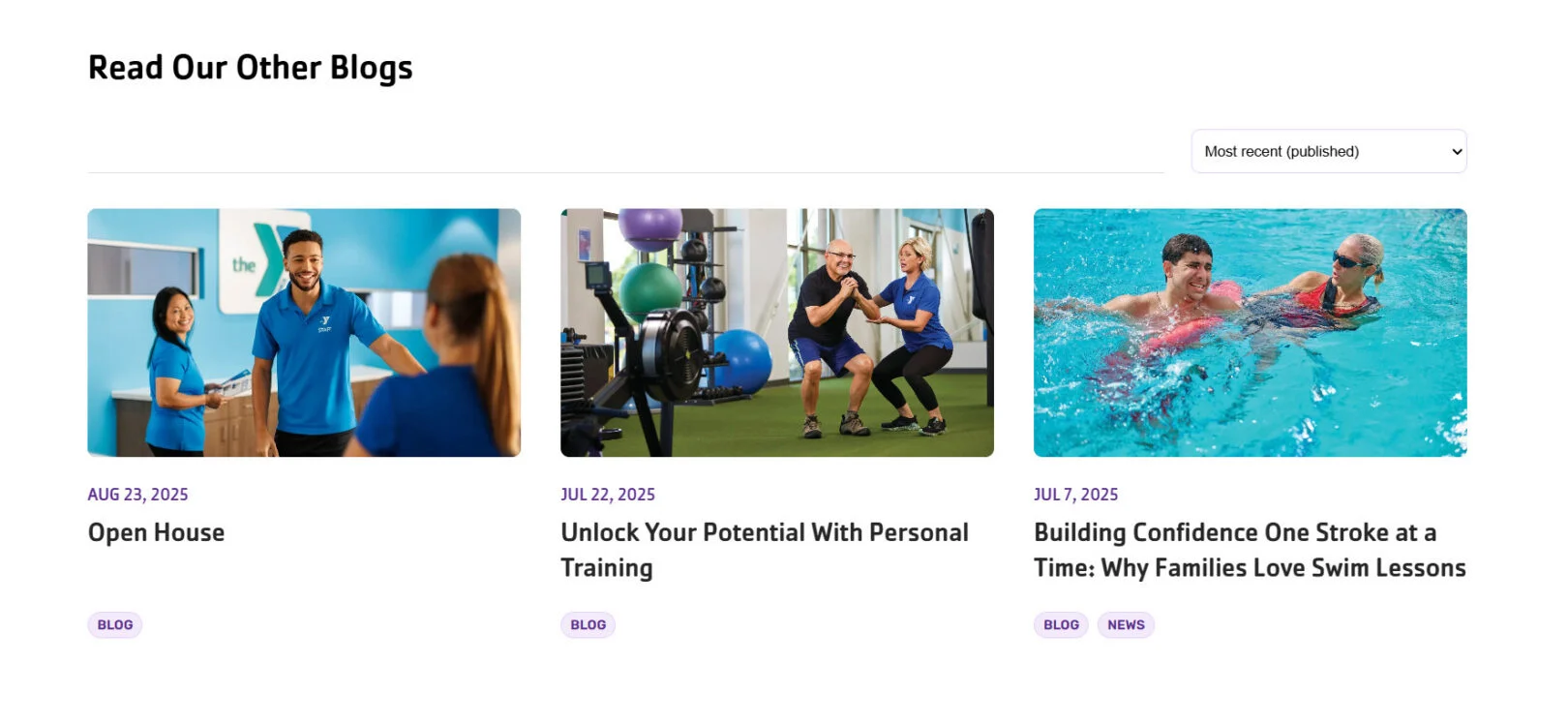
Headline: Displays as the bold main title of the section. Use 2–5 words.
Category: Select one or more categories to filter content.
Posts Per Page: Set how many posts are displayed at once before the “Load More” option appears.
Blog: Longform
Use this module to build the main body of a blog post, including the title and introductory information.

Headline: Displays as the bold main title of the section. Use 2–5 words.
Post Intro: An introductory paragraph prior to the beginning of the rest of the blogs content modules.
Content Intro: Optional additional introductory paragraph prior to the beginning of the rest of the blogs content modules.
Blog: Meta
Use this module if you would like to overwrite the meta information about your post.
Title:
Author:
Publish Date:
Summary:
Promo Copy:
Promo CTA Text:
Promo CTA URL: